Chips Analysis - Task 1
python
import pandas as pd

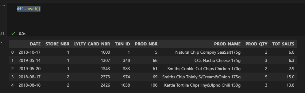
df1 = pd.read_excel(r"C:\Users\viorel\OneDrive\Desktop\QVI_transaction_data.xlsx")
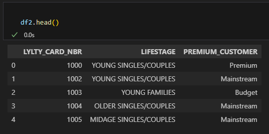
df2 = pd.read_excel(r"C:\Users\viorel\OneDrive\Desktop\QVI_transaction_data.xlsx",sheet_name='QVI_purchase_behaviour')

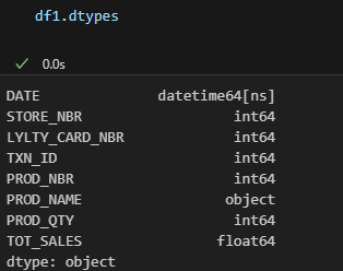
df1['DATE'] = pd.to_datetime(df1['DATE'], unit='D',origin= '1899-12-30')
 1 / 23
 2 / 23
 3 / 23
python
#Numbers and last 'g' removed
df1['PROD_NAME'] = df1['PROD_NAME'].str.replace(r'\d+g$', '', regex=True)
#Special character removed
df1['PROD_NAME'] = df1['PROD_NAME'].str.replace(r'[^A-Za-z0-9 ]+', '', regex=True)
#removing the rows with the word 'SALSA'
df1 = df1[~df1['PROD_NAME'].str.lower().str.contains('salsa')]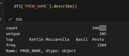 4 / 23
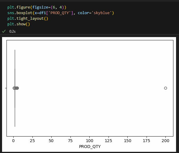 5 / 23
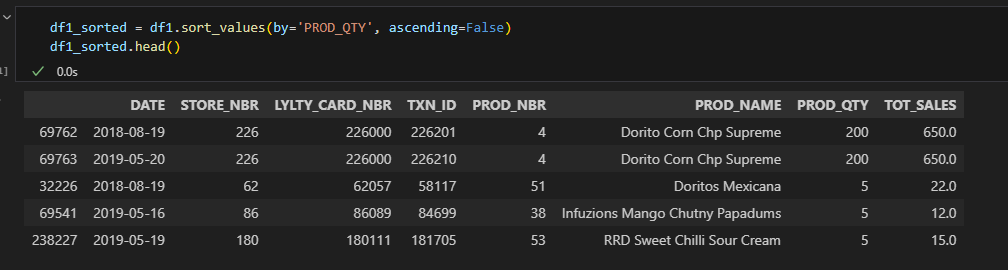 6 / 23
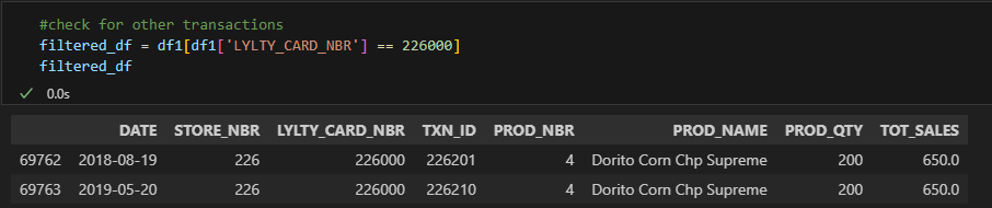 7 / 23
sql
#delete rows where Loyality card nr. = 226000(keep others)
df1 = df1[df1['LYLTY_CARD_NBR'] != 226000]
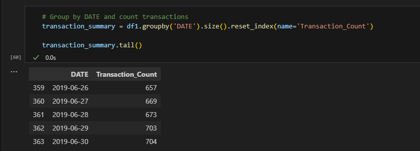 8 / 23
sql
#Data range converted to Dataframe
date_range = pd.date_range(start='2018-07-01', end='2019-06-30', freq='D')
data_df = pd.DataFrame({'DATE': date_range})

# join the tables
merged_df = pd.merge(data_df, df1, on='DATE', how='left')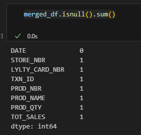 9 / 23
 10 / 23
python
import plotly.express as px

fig = px.line(transaction_summary, x='DATE', y='Transaction_Count')


fig.update_layout(
    xaxis=dict(tickformat="%b\n%Y"),  # Month and year on X-axis
    xaxis_title='Day',
    yaxis_title='Number of transactions',
    title={'text': 'Transactions over Time','x': 0.5}

)

fig.show()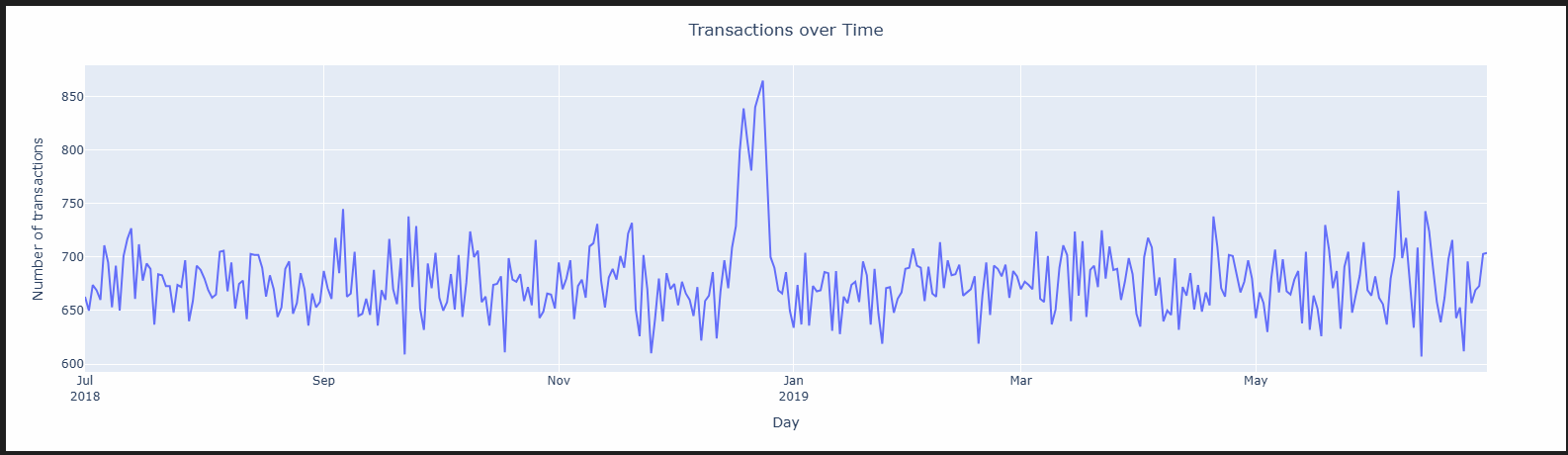 11 / 23
python
# Filter only December (month = 12)
december_df = transaction_summary[transaction_summary['DATE'].dt.month == 12]
december_df
python
fig = px.line(december_df, x='DATE', y='Transaction_Count')


fig.update_layout(
    xaxis=dict(tickformat="%b\n%Y"),  # Month and year on X-axis
    xaxis_title='Day',
    yaxis_title='Number of transactions',
    title={'text': 'Transactions over Time in December','x': 0.5}
)

fig.show()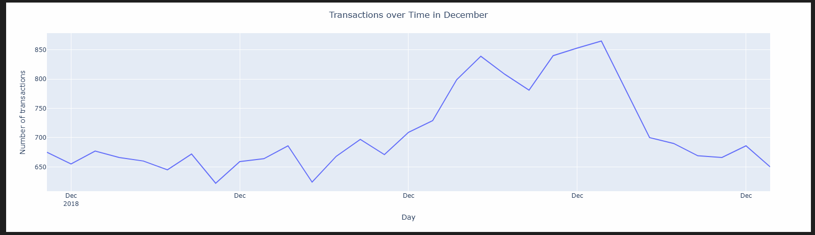 12 / 23
python
#Bringing back Prod. size
new_df = pd.read_excel(r"C:\Users\viorel\OneDrive\Desktop\QVI_transaction_data.xlsx")
#Creeate a new column with pack Size
new_df['PACK_SIZE'] = new_df['PROD_NAME'].str.extract('(\d+)')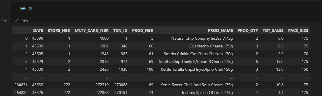 13 / 23
python
new_df['PACK_SIZE'] = new_df['PACK_SIZE'].astype(int)
new_df.dtypes

#check min/max of pack size
new_df['PACK_SIZE'].max()
new_df['PACK_SIZE'].min()
python
plt.figure(figsize=(10, 6))
plt.hist(new_df['PACK_SIZE'], bins=20, edgecolor='black')
plt.title('Number of Transactions by Pack Size')
plt.xlabel('Pack Size (g)')
plt.ylabel('Number of Transactions')
plt.grid(True)
plt.show()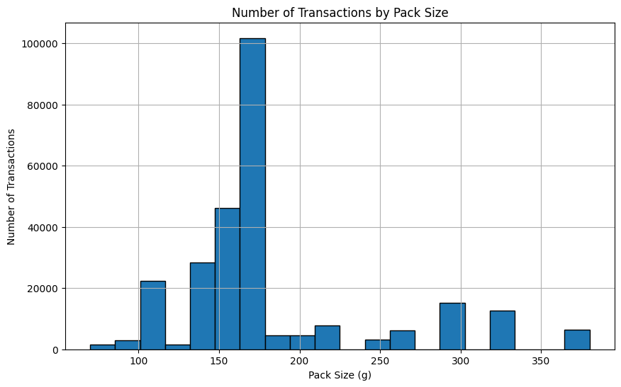 14 / 23
python
#extracting brand name from product name
new_df['BRAND'] = new_df['PROD_NAME'].str.extract(r'^([A-Za-z]+)')
#change Brand name from RED to RRD
new_df.loc[new_df['BRAND'] == 'RED','BRAND'] = 'RRD'
python
#Merge transaction data to customer data
df2 = pd.merge(df2,new_df,how='left',on='LYLTY_CARD_NBR')
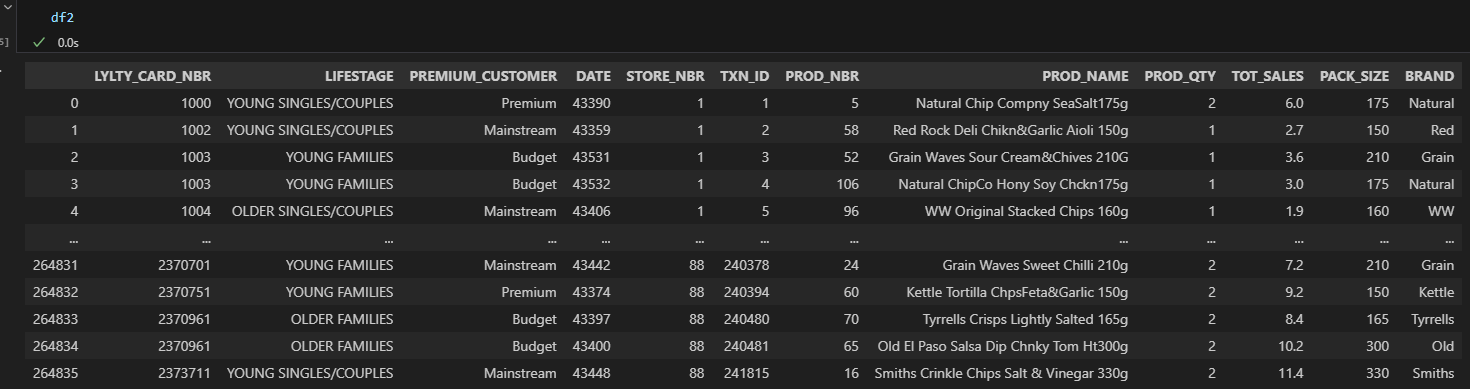 15 / 23
python
##Group by Lifestage and Premium Customer
summary_sales = df2.groupby(['LIFESTAGE', 'PREMIUM_CUSTOMER'])['TOT_SALES'].sum().reset_index()
#
#plot summary
import seaborn as sns
import matplotlib.pyplot as plt

plt.figure(figsize=(12,6))
sns.barplot(
    data=summary_sales,
    x='LIFESTAGE',
    y='TOT_SALES',
    hue='PREMIUM_CUSTOMER'
)
plt.xticks(rotation=45)
plt.title('Total Sales by Lifestage and Premium Customer Segment')
plt.ylabel('Total Sales ($)')
plt.xlabel('Customer Lifestage')
plt.tight_layout()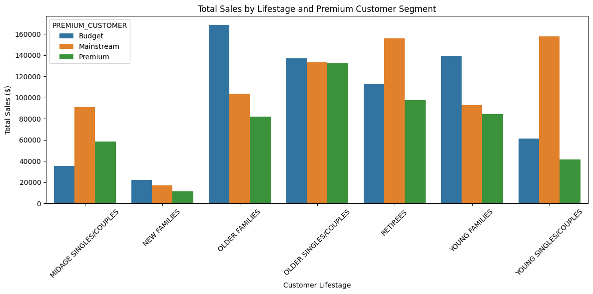 16 / 23
python
#Count customers by Lifestage and Premuium Customer
customer_count = df2.groupby(['LIFESTAGE','PREMIUM_CUSTOMER'])['LYLTY_CARD_NBR'].nunique().reset_index()
##Rename new Column
customer_count.rename(columns={'LYLTY_CARD_NBR': 'NUM_CUSTOMERS'},inplace=True)
python
#Plot Number of Customers
plt.figure(figsize=(12, 6))
sns.barplot(data=customer_count,
            x='LIFESTAGE',
            y='NUM_CUSTOMERS',
            hue='PREMIUM_CUSTOMER')
plt.title('Number of Customers by Lifestage and Premium Status')
plt.xticks(rotation=45)
plt.ylabel('Number of Customers')
plt.tight_layout()
plt.show()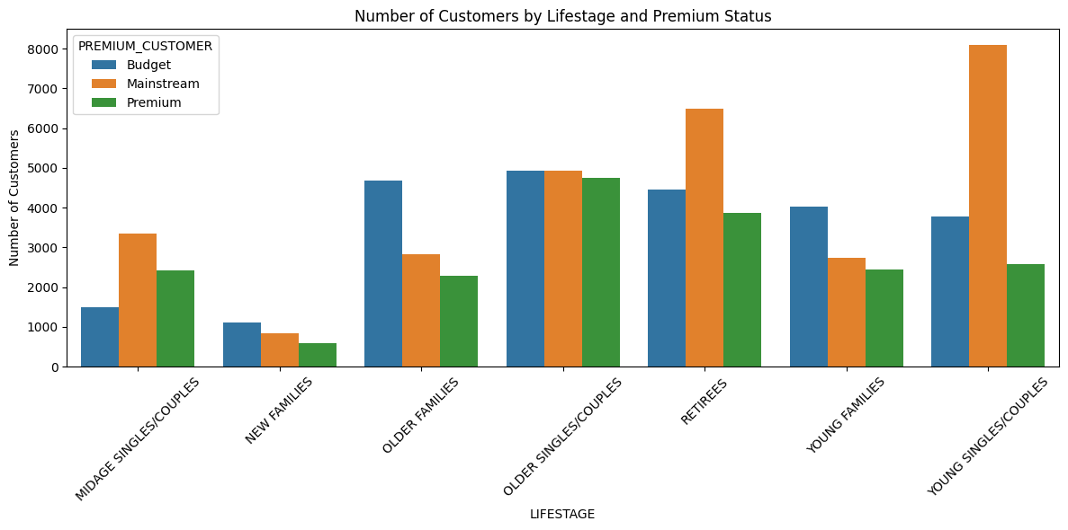 17 / 23
sql
# Group by LIFESTAGE and PREMIUM_CUSTOMER
avg_units = df2.groupby(['LIFESTAGE', 'PREMIUM_CUSTOMER'])[['PROD_QTY', 'LYLTY_CARD_NBR']].agg({
    'PROD_QTY': 'sum',
    'LYLTY_CARD_NBR': pd.Series.nunique
}).reset_index()

# Average units per customer
avg_units['AVG_UNITS_PER_CUSTOMER'] = avg_units['PROD_QTY'] / avg_units['LYLTY_CARD_NBR']

print(avg_units[['LIFESTAGE', 'PREMIUM_CUSTOMER', 'AVG_UNITS_PER_CUSTOMER']])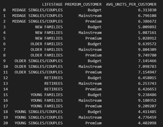 18 / 23
python
#Plot Average Units sold per Customer by Lifestage and Premium Customer
plt.figure(figsize=(12, 6))
sns.barplot(
    data=avg_units,
    x='LIFESTAGE',
    y='AVG_UNITS_PER_CUSTOMER',
    hue='PREMIUM_CUSTOMER'
)

plt.title('Average Units Sold per Customer by Lifestage and Premium Status')
plt.ylabel('Average Units Sold per Customer')
plt.xticks(rotation=45)
plt.tight_layout()
plt.show()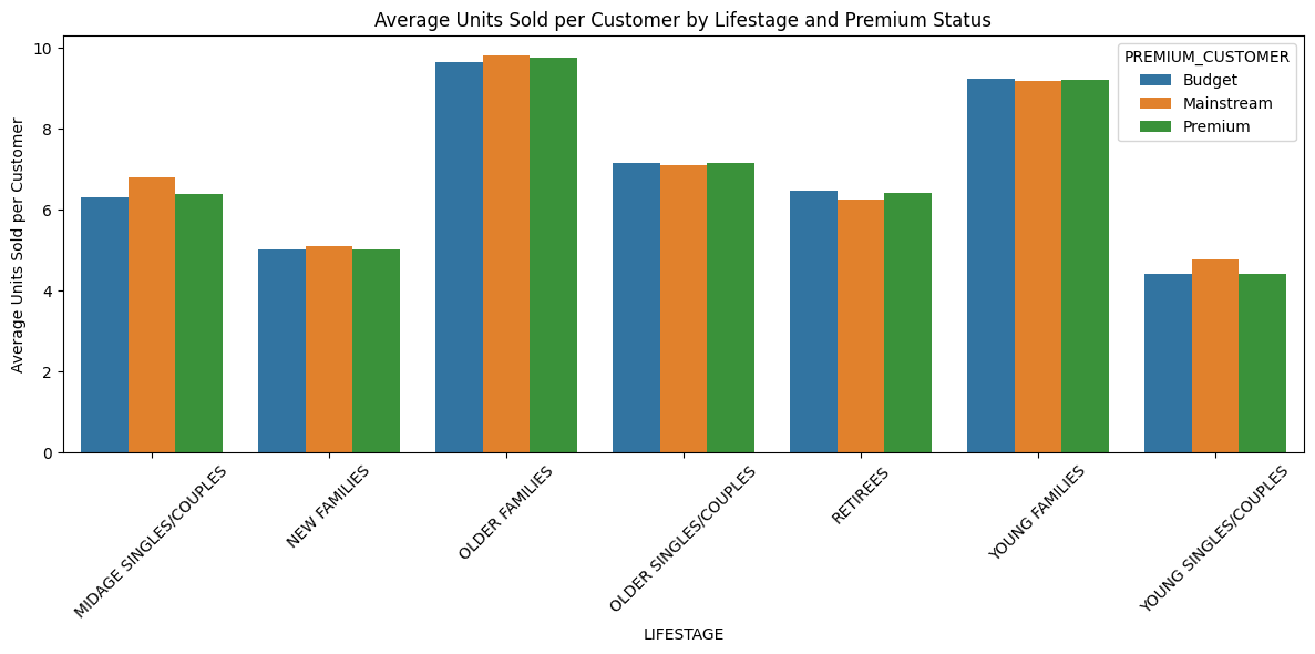 19 / 23
sql
# Group by LIFESTAGE and PREMIUM_CUSTOMER
avg_price = df2.groupby(['LIFESTAGE', 'PREMIUM_CUSTOMER'])[['TOT_SALES', 'PROD_QTY']].sum().reset_index()
#Average price per unit sold
avg_price['AVG_PRICE_PER_UNIT'] = avg_price['TOT_SALES'] / avg_price['PROD_QTY']
python
#Plot Average Price per unit by Lifestage and Premium Customer
plt.figure(figsize=(12, 6))
sns.barplot(
    data=avg_price,
    x='LIFESTAGE',
    y='AVG_PRICE_PER_UNIT',
    hue='PREMIUM_CUSTOMER'
)

plt.title('Average Price per Unit by Lifestage and Premium Customer')
plt.ylabel('Average Price per Unit (AUD)')
plt.xticks(rotation=45)
plt.tight_layout()
plt.show()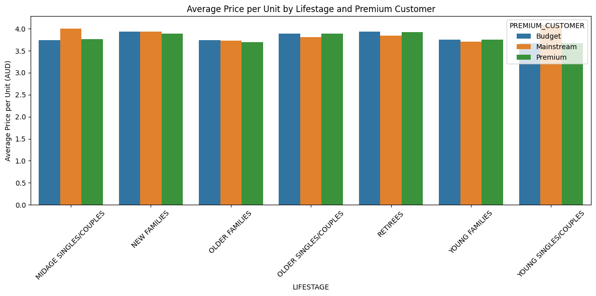 20 / 23
python
#T-Test between mainstream vs premium and budget midage
 !pip install scipy

 from scipy.stats import ttest_ind

#Mainstream = total sales from Mainstream
#Premium_budget = Total sales from Premium and Budget
mainstream = Young[Young['PREMIUM_CUSTOMER'] == 'Mainstream']['TOT_SALES']
premium_budget = Young[Young['PREMIUM_CUSTOMER'].isin(['Premium', 'Budget'])]['TOT_SALES']

#T-Test
t_stat, p_value = ttest_ind(mainstream, premium_budget, equal_var=False)

print("T-statistic:", t_stat)
print("P-value:", p_value)

#T-statistic: 33.81791350094285
#P-value: 2.293095632338085e-246

#significant difference between the mainstream group and the premium and budget group.
#The chances that this difference happened randomly are almost zero.
python
#Young Single/Couples
#They tend to buy a particular brand of chips?
mainstream_young = df2[
    (df2['LIFESTAGE'] == 'YOUNG SINGLES/COUPLES') &
    (df2['PREMIUM_CUSTOMER'] == 'Mainstream')
]

#proportions (percentages) instead of count.
brand_counts = mainstream_young['BRAND'].value_counts(normalize=True)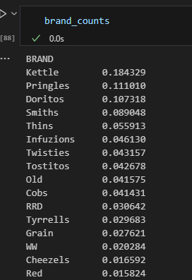 21 / 23
python
#Rest of the population (everything except Mainstream Young Singles/couples(~) )
rest_of_population = df2[
    ~((df2['LIFESTAGE'] == 'YOUNG SINGLES/COUPLES') &
      (df2['PREMIUM_CUSTOMER'] == 'Mainstream'))
]

rest_brand_counts = rest_of_population['BRAND'].value_counts(normalize=True)

#Comparasion Dataframe

brand_pref = pd.DataFrame({
    'Mainstream_Young': brand_counts,
    'Others': rest_brand_counts
}).fillna(0)

#Affinity Analysis & Lift
#How much more a customer group prefers a brand compared to the rest of the customers.
brand_pref['Lift'] = brand_pref['Mainstream_Young'] / brand_pref['Others']
brand_pref = brand_pref.sort_values(by='Lift', ascending=False)

#Mainstream Young - What brand they prefer.
#The entire Population - What brand they prefer.
#Lift - Mainsteam Young are more likely to buy those brands vs average.

#Ex: Mainstream Young customers are 24% more likely to buy Tyrrells Brand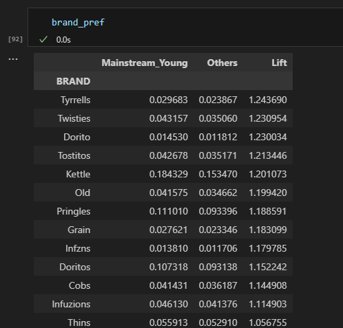 22 / 23
python
# Proportions of pack size purchases for Mainstream Young
mainstream_young = df2[(df2['LIFESTAGE'] == 'YOUNG SINGLES/COUPLES') & (df2['PREMIUM_CUSTOMER'] == 'Mainstream')]
mainstream_young_dist = (mainstream_young['PACK_SIZE'].value_counts(normalize=True)
                         .rename('Mainstream_Young'))

# Calculate proportions for the rest of the population
others = df2[~((df2['LIFESTAGE'] == 'YOUNG SINGLES/COUPLES') & (df2['PREMIUM_CUSTOMER'] == 'Mainstream'))]
others_dist = (others['PACK_SIZE'].value_counts(normalize=True)
               .rename('Others'))

#Comparasion Dataframe

pack_pref = pd.DataFrame({
    'Mainstream_Young': mainstream_young_dist,
    'Others': others_dist
}).fillna(0)

#Affinity Analysis & Lift

pack_pref['Lift'] = pack_pref['Mainstream_Young'] / pack_pref['Others']
pack_pref = pack_pref.sort_values(by='Lift', ascending=False)

#Mainstream Young Customers tends to buy specific pack size.

#Ex: Mainstream Young customers are 28% more likely to buy pack Size of 270g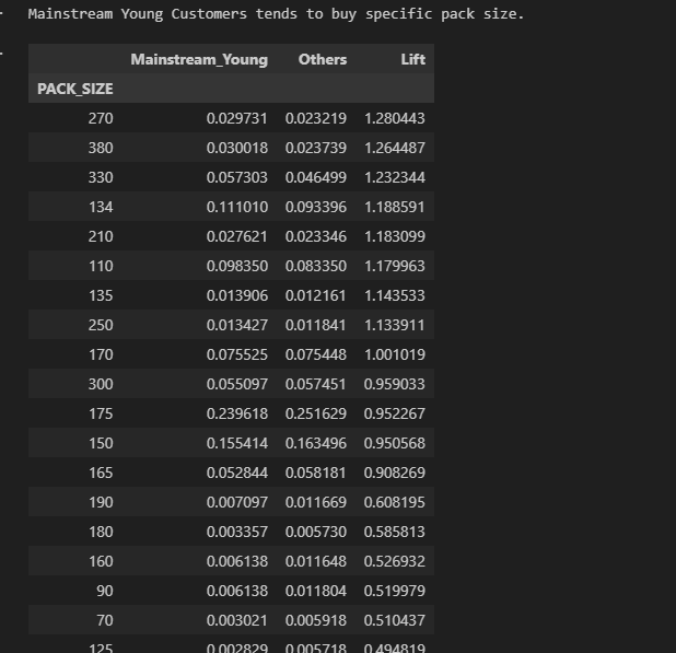 23 / 23